TONY G'S
fresh identity rooted in southern tradition
restaurant rebrand
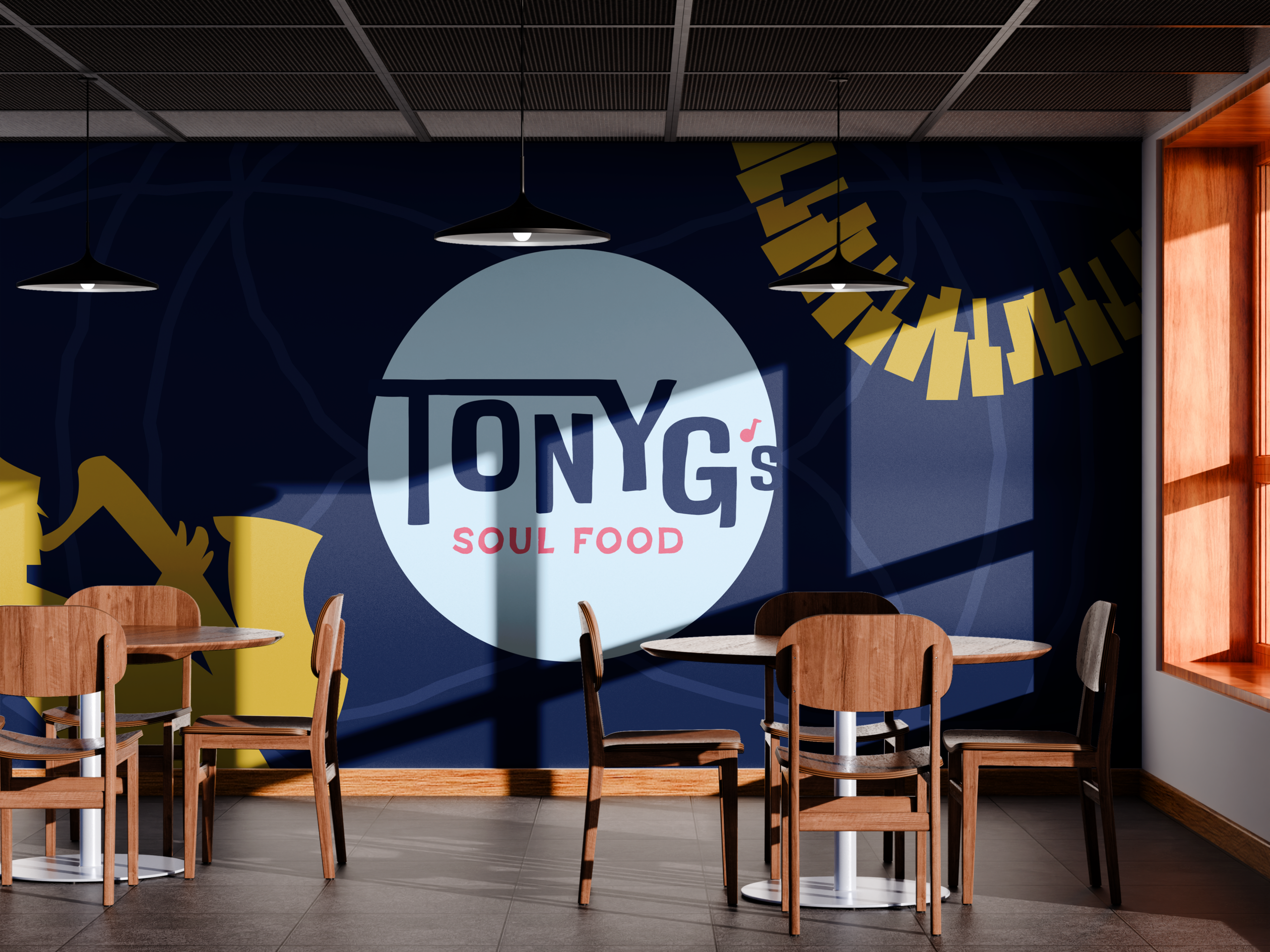
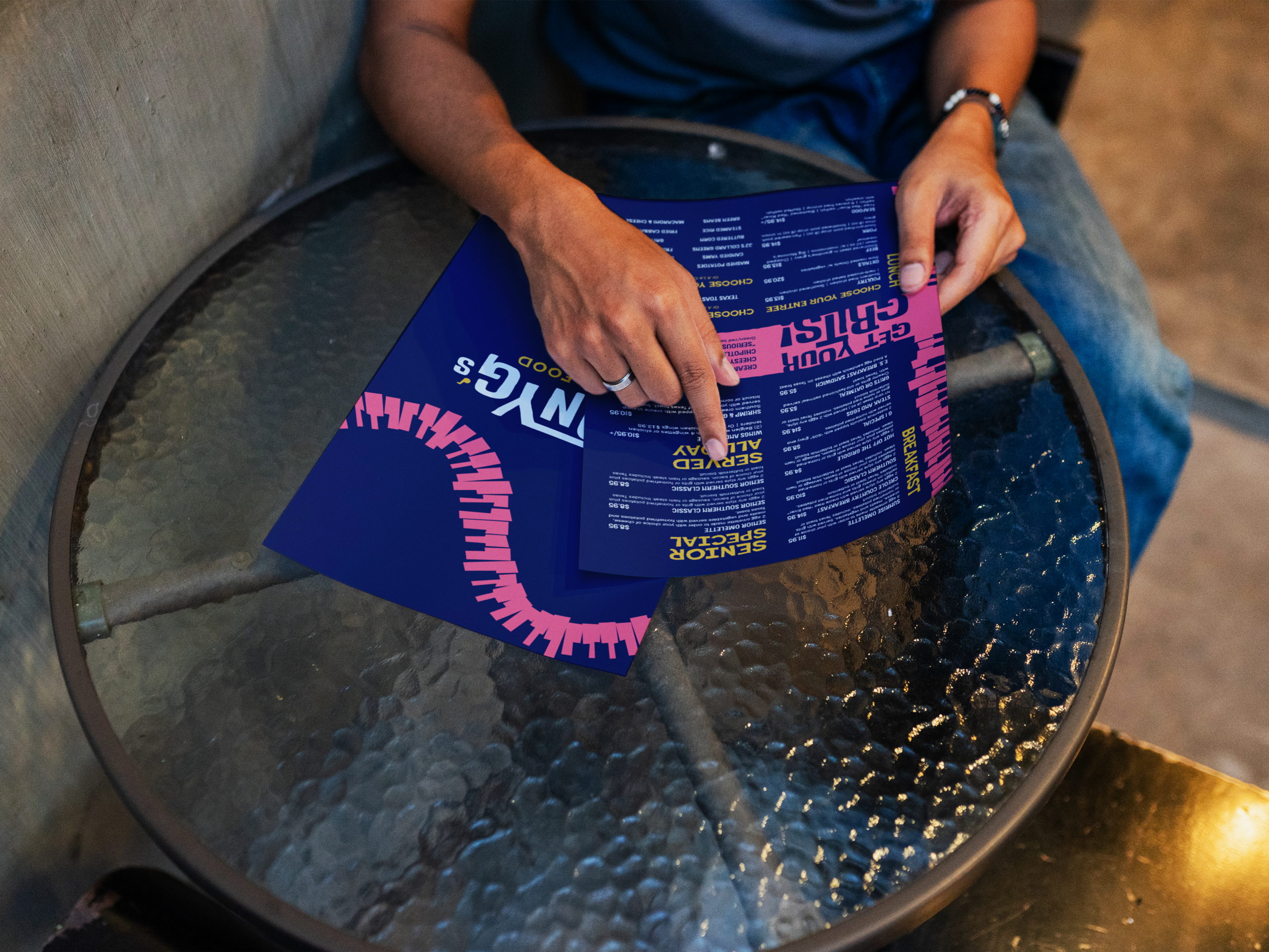
This project focuses on the rebrand of Tony G’s, a local restaurant known for its Southern hospitality and community spirit, to create a new identity, menu, and brand book that highlight its blend of soul food and live jazz while honoring its existing brand equity. The redesign emphasizes a warm, inviting visual language that reflects both the richness of Southern cuisine and the rhythm of its musical atmosphere. Through cohesive typography, color, and imagery, the brand aims to create a memorable dining experience that feels both authentic and refreshed.
what i did
- Brand identity
- Logo design
- Menu design
- Brand guidelines
- Color theory
- Typography
- Visual storytelling
- Layout design
color palette
This gold brings a sense of warmth, richness, and comfort, reflecting the hearty, soulful nature of the food. It also adds a touch of vibrancy and energy, inspired by music and the lively atmosphere of the space.
The soft pink introduces personality and playfulness, helping the brand feel modern and approachable. It adds contrast to the deeper tones while bringing in a sense of rhythm and movement inspired by music culture.
This deep blue grounds the identity with a sense of depth and sophistication. It creates a strong backdrop that allows the brighter colors to stand out while reflecting the smooth, soulful vibe of the restaurant.