veni vidi vici

a bold trilogy of flavor, color, and conquest

Branding + Packaging Design

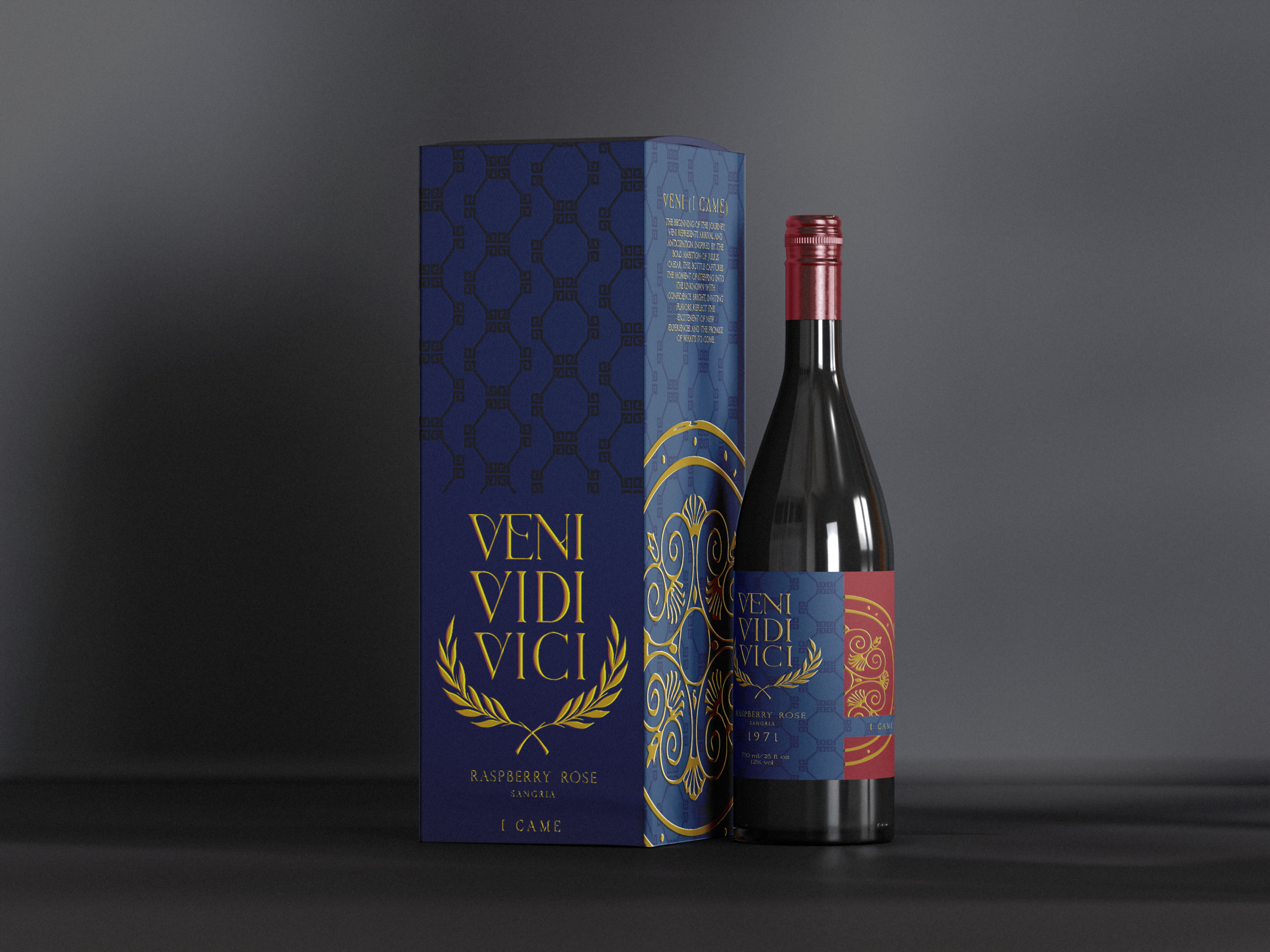
A series of beverages based concept trio “Veni Vidi Vici,” the famous Roman phrase attributed to Julius Caesar. Sangria allows for a vibrant presentation to allow the bottle design to highlight the rich color of the wine inside. Each label draws inspiration from Roman iconography, blending classical motifs with modern elegance. The overall design aims to create a memorable, collectible experience that reflects both history and indulgence.

what i did

  • Illustrative
  • Minimalist
  • Editorial
  • Hand-drawn
  • Typographic
  • Sequential

color palette

The gold represents power, victory, and prestige, directly referencing the triumph and authority associated with Roman culture. It elevates the packaging with a sense of luxury and importance, reinforcing the “Veni Vidi Vici” concept of conquest.

This deep red draws from wine itself while also symbolizing strength, passion, and dominance. It connects to the idea of battle and triumph, adding richness and emotional intensity to the design.

The dark blue introduces depth and sophistication, balancing the warmth of the red and gold. It reflects intelligence and strategy, tying into the calculated nature behind the phrase “I came, I saw, I conquered.”

final product